
Built to Persist by Design
Visual language, structure, and the refinement of identity through time


Identity systems rarely begin at the moment they are named. Long before anything is visualized or shared publicly, there is usually a way of thinking already in motion. In my case, the idea of “shift” existed well before moinahmad.com ever did. It was already complete as a worldview and a method. What it lacked at the time was not clarity, but visual codification and public articulation.
The moinahmad.com logo was the first serious attempt to give that thinking a visible structure.
That mark was built around assertion and form. Its geometry resolved into a capital M, reinforced by a smaller capital A that buttressed the right side. The angles were sharp by design. The negative space was intentional. Nothing about the mark was ornamental. It was meant to feel load-bearing.

The legs of the mark mattered because they represented what I stood for and what I offered through my work: design, development, and branding. Each discipline was treated as something that carried weight. The structure reflected how I approached problems at the time. Direct. Explicit. Uncompromising. The logo did not attempt to soften itself. It said, this is where I stand, and this is what I stand for.
That identity served its purpose well. It was stable, distinct, and structurally honest. Over time, however, the questions I was asking of my work began to change. I became less interested in simply establishing presence and more interested in orientation. Not just where I was, but where I was going.
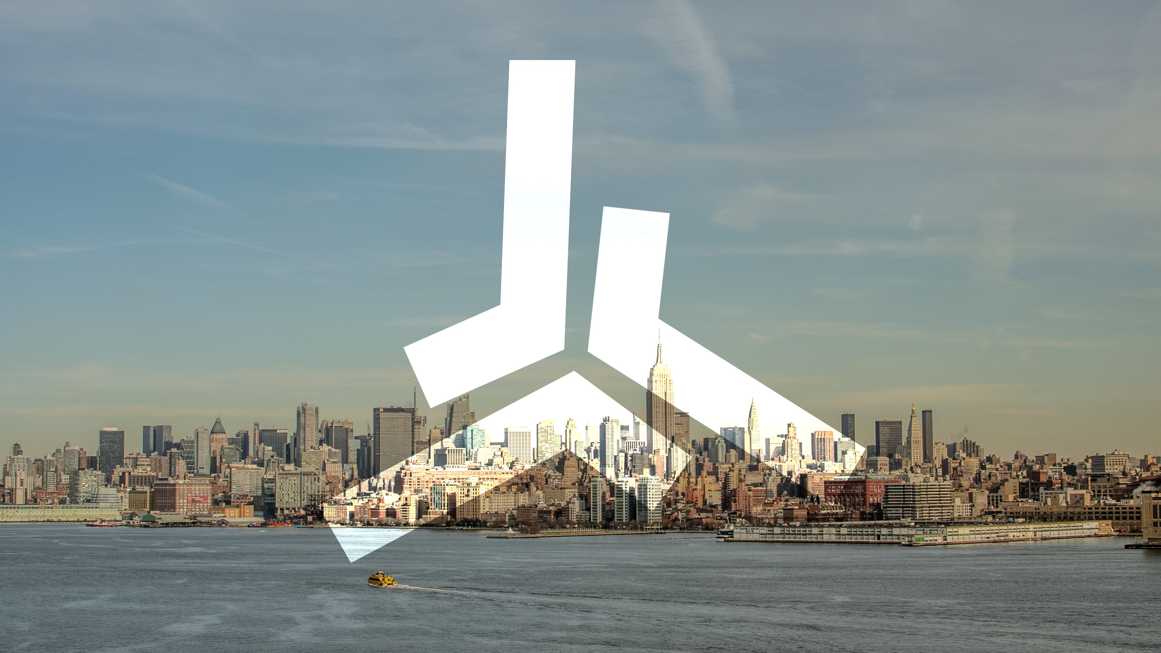
Before the shiftOS mark existed, I spent a long time thinking about identity as a vector rather than a symbol.
A point tells you where something is. A vector tells you where it is, where it is headed, and with what force.
Momentum matters. Direction matters. Excellence is not a static state. It is sustained movement, applied deliberately, over time. That framing began to influence how I thought about identity, skill, and growth, not as endpoints, but as trajectories.
The shiftOS identity grew directly out of that thinking.
If you want to see the mark as a designed object rather than as a description, the full visual system is published here:
shiftOS Personal Identity System at Dribbble
That Dribbble post documents the shiftOS identity as a cohesive system rather than a standalone logo. It shows the mark in its intended proportions and spacing, how the geometry behaves across different placements, and how the visual language stays sharp without becoming ornamental. The goal is not to present a symbol that “means everything,” but a structure that consistently communicates orientation, intent, and motion.
Before the shiftOS mark existed, I spent a long time thinking about identity as a vector rather than a symbol.
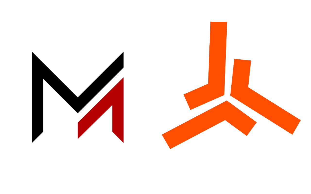
Where the moinahmad.com logo emphasized posture and structure, the shiftOS mark emphasizes orientation and motion. The geometry transitions from orthogonal construction to triangular composition. This was not an aesthetic exercise. Triangles imply intent. They point. They converge. They resist neutrality. They suggest movement even when still.
A point tells you where something is. A vector tells you where it is, where it is headed, and with what force.
The influence of targeting systems and directional interfaces is deliberate. Games like Halo, Metal Gear Solid, and Unreal Tournament use visual language designed around focus under pressure. Their interfaces exist to answer two questions clearly and quickly: where now, and where to.
That duality mattered to me.
The shiftOS mark encodes that logic. It is not about being centered. It is about being oriented. Each leg is placed with intent, favoring odd and prime relationships that feel resolved without becoming static. The form resists symmetry for symmetry’s sake. It is meant to feel directional, not decorative.
There is also a personal dimension to this work. Identity does not evolve in isolation. Over time, responsibility reshapes perspective, and family reframes how you measure growth, patience, and direction. Becoming a parent changes how you think about continuity, not just in life, but in the systems you design and the standards you hold yourself to.
The shiftOS mark reflects that maturation. It balances analytical rigor with creative openness, discipline with curiosity. The geometry remains precise, but it no longer exists only to assert. It exists to guide, to move forward deliberately, and to remain flexible without losing intent.
What persists across both identities is a commitment to using geometry as meaning. Sharpness is not an aesthetic preference. It is a refusal to dilute intent. Structure is not decorative. It exists to carry values forward with precision and consistency. Every angle, intersection, and proportion is chosen to say something directly, without embellishing.
The relationship between the two marks is best understood as continuity rather than reinvention. The earlier identity was about making my mark on the map. It established presence, structure, and stance. The shiftOS identity takes that same foundation and extends it into motion. It is about the journey across that map, toward a destination that continues to refine itself over time.
Another way to see the difference is dimensional. The earlier mark offered a two-dimensional view of the work and the person behind it. The shiftOS mark adds depth. It introduces orientation, direction, and momentum. It does not change the subject. It changes the perspective.
This is what identity looks like when it is treated with depth rather than as a snapshot.
Not a moment frozen in time, but a commitment to movement, excellence, and deliberate progress. The mark does not ask to be interpreted. It asks to be followed.
This is what identity looks like when it is treated with depth rather than as a snapshot.
Moin.shift().forward